LAHC Style Guide
Color Pallette
Primary:
Secondary:
Tertiary:
Interactive Dark
(Default):
Interactive Dark
(Hover):
Interactive Light
(Default):
Interactive Light
(Hover):
Transparencies
Version 1:
Transparencies
Version 2:
Transparencies
Version 3:
Module:
Text Styles
The text style guide displays important styles within current row themes (Default, Soft Gray, Legacy I, Primary, Accent and Legacy II) including headlines, copy, links, horizontal lines, bulleted lists, numbered lists, a block quote, three button styles, two link styles and a table format. The font family for LACCD web sites is Proxima Nova.
Text Styles in Default Theme
H1 Headline / Proxima Nova Bold
H2 Headline / Proxima Nova Bold
H3 Headline / Proxima Nova Bold
H4 Headline / Proxima Nova Semibold
H5 Headline / Proxima Nova Semibold
H6 Headline / Proxima Nova Semibold
Body (Normal) /Proxima Nova Regular
Body Link /Proxima Nova Regular
| Tag | Font | Pixels | EM |
|---|---|---|---|
| H1 | Proxima Nova Bold | 50 | 3.125 |
| H2 | Proxima Nova Bold | 44 | 2.75 |
| H3 | Proxima Nova Bold | 36 | 2.25 |
| H4 | Proxima Nova Semibold | 28 | 1.75 |
| H5 | Proxima Nova Semibold | 22 | 1.375 |
| H6 | Proxima Nova Semibold | 18 | 1.125 |
| Body (Normal) | Proxima Nova Regular | 16 | 1 |
| Body Link | Proxima Nova Regular | 16 | 1 |
Please note: Headline styles (sizes) must be used in a sequencial order for ADA compliance. For example, a page headline can be an H1 designation with an H2 sub-headline following, and then body text (Normal). However, a page beginning with an H3 headline followed by an H1 headline and body copy is not consistent with compliance guidelines. (Source)
This the body text styled with "Normal." Links made in body text will display with a color, example: Link example. When creating the link, complete the Title field. This populates the title attribute of the link, usually shown as a small tooltip on hover.
Insert Horizontal Line
Example shown above and below.
Insert/Remove Bulleted List
- This is a bullet item
- This is a bullet item
- This is a bullet item
- This is a bullet item
Insert/Remove Numbered List
- This is a bullet item
- This is a bullet item
Block Quote
Never put off till tomorrow what you can do the day after tomorrow.
Button Styles
Buttons have a default state and a hover state (color changes when cursor hovers over button). Button Large and Button can expand to the width of the text inside, while Button Fixed Width does not.
Button Large Place cursor over buttons to reveal hover state color change.
Link Styles
Link - This style is generally for body text and list items.
Link Arrow - This link style can call attention to a link or be a call-to-action style link/highlight.
Table Title (Optional)
This section is available for table descriptive copy. Tables will work on neutral as well as Primary and Secondary colors.
| Column Label | Column Label | Column Label | Column Label | |
|---|---|---|---|---|
| Row Label | Content | 1000.00 | Content | 1000.00 |
| Row Label | Content | 1000.00 | Content | 1000.00 |
| Row Label | Content | 1000.00 | Content | 1000.00 |
| Row Label | Content | 1000.00 | Content | 1000.00 |
Text Styles in Soft Gray Theme
H1 Headline / Proxima Nova Bold
H2 Headline / Proxima Nova Bold
H3 Headline / Proxima Nova Bold
H4 Headline / Proxima Nova Semibold
H5 Headline / Proxima Nova Semibold
H6 Headline / Proxima Nova Semibold
Body (Normal) /Proxima Nova Regular
Body Link /Proxima Nova Regular
| Tag | Font | Pixels | EM |
|---|---|---|---|
| H1 | Proxima Nova Bold | 50 | 3.125 |
| H2 | Proxima Nova Bold | 44 | 2.75 |
| H3 | Proxima Nova Bold | 36 | 2.25 |
| H4 | Proxima Nova Semibold | 28 | 1.75 |
| H5 | Proxima Nova Semibold | 22 | 1.375 |
| H6 | Proxima Nova Semibold | 18 | 1.125 |
| Body (Normal) | Proxima Nova Regular | 16 | 1 |
| Body Link | Proxima Nova Regular | 16 | 1 |
Please note: Headline styles (sizes) must be used in a sequencial order for ADA compliance. For example, a page headline can be an H1 designation with an H2 sub-headline following, and then body text (Normal). However, a page beginning with an H3 headline followed by an H1 headline and body copy is not consistent with compliance guidelines. (Source)
This the body text styled with "Normal." Links made in body text will display with a color, example: Link example. When creating the link, complete the Title field. This populates the title attribute of the link, usually shown as a small tooltip on hover.
Insert Horizontal Line
Example shown above and below.
Insert/Remove Bulleted List
- This is a bullet item
- This is a bullet item
- This is a bullet item
- This is a bullet item
Insert/Remove Numbered List
- This is a bullet item
- This is a bullet item
Block Quote
Never put off till tomorrow what you can do the day after tomorrow.
Button Styles
Buttons have a default state and a hover state (color changes when cursor hovers over button). Button Large and Button can expand to the width of the text inside, while Button Fixed Width does not.
Button Large Place cursor over buttons to reveal hover state color change.
Link Styles
Link - This style is generally for body text and list items.
Link Arrow - This link style can call attention to a link or be a call-to-action style link/highlight.
Table Title (Optional)
This section is available for table descriptive copy. Tables will work on neutral as well as Primary and Secondary colors.
| Column Label | Column Label | Column Label | Column Label | |
|---|---|---|---|---|
| Row Label | Content | 1000.00 | Content | 1000.00 |
| Row Label | Content | 1000.00 | Content | 1000.00 |
| Row Label | Content | 1000.00 | Content | 1000.00 |
| Row Label | Content | 1000.00 | Content | 1000.00 |
Text Styles in Legacy I Theme
H1 Headline / Proxima Nova Bold
H2 Headline / Proxima Nova Bold
H3 Headline / Proxima Nova Bold
H4 Headline / Proxima Nova Semibold
H5 Headline / Proxima Nova Semibold
H6 Headline / Proxima Nova Semibold
Body (Normal) /Proxima Nova Regular
Body Link /Proxima Nova Regular
| Tag | Font | Pixels | EM |
|---|---|---|---|
| H1 | Proxima Nova Bold | 50 | 3.125 |
| H2 | Proxima Nova Bold | 44 | 2.75 |
| H3 | Proxima Nova Bold | 36 | 2.25 |
| H4 | Proxima Nova Semibold | 28 | 1.75 |
| H5 | Proxima Nova Semibold | 22 | 1.375 |
| H6 | Proxima Nova Semibold | 18 | 1.125 |
| Body (Normal) | Proxima Nova Regular | 16 | 1 |
| Body Link | Proxima Nova Regular | 16 | 1 |
Please note: Headline styles (sizes) must be used in a sequencial order for ADA compliance. For example, a page headline can be an H1 designation with an H2 sub-headline following, and then body text (Normal). However, a page beginning with an H3 headline followed by an H1 headline and body copy is not consistent with compliance guidelines. (Source)
This the body text styled with "Normal." Links made in body text will display with a color, example: Link example. When creating the link, complete the Title field. This populates the title attribute of the link, usually shown as a small tooltip on hover.
Insert Horizontal Line
Example shown above and below.
Insert/Remove Bulleted List
- This is a bullet item
- This is a bullet item
- This is a bullet item
- This is a bullet item
Insert/Remove Numbered List
- This is a bullet item
- This is a bullet item
Block Quote
Never put off till tomorrow what you can do the day after tomorrow.
Button Styles
Buttons have a default state and a hover state (color changes when cursor hovers over button). Button Large and Button can expand to the width of the text inside, while Button Fixed Width does not.
Button Large Place cursor over buttons to reveal hover state color change.
Link Styles
Link - This style is generally for body text and list items.
Link Arrow - This link style can call attention to a link or be a call-to-action style link/highlight.
Table Title (Optional)
This section is available for table descriptive copy. Tables will work on neutral as well as Primary and Secondary colors.
| Column Label | Column Label | Column Label | Column Label | |
|---|---|---|---|---|
| Row Label | Content | 1000.00 | Content | 1000.00 |
| Row Label | Content | 1000.00 | Content | 1000.00 |
| Row Label | Content | 1000.00 | Content | 1000.00 |
| Row Label | Content | 1000.00 | Content | 1000.00 |
Text Styles in Primary Theme
H1 Headline / Proxima Nova Bold
H2 Headline / Proxima Nova Bold
H3 Headline / Proxima Nova Bold
H4 Headline / Proxima Nova Semibold
H5 Headline / Proxima Nova Semibold
H6 Headline / Proxima Nova Semibold
Body (Normal) /Proxima Nova Regular
Body Link /Proxima Nova Regular
| Tag | Font | Pixels | EM |
|---|---|---|---|
| H1 | Proxima Nova Bold | 50 | 3.125 |
| H2 | Proxima Nova Bold | 44 | 2.75 |
| H3 | Proxima Nova Bold | 36 | 2.25 |
| H4 | Proxima Nova Semibold | 28 | 1.75 |
| H5 | Proxima Nova Semibold | 22 | 1.375 |
| H6 | Proxima Nova Semibold | 18 | 1.125 |
| Body (Normal) | Proxima Nova Regular | 16 | 1 |
| Body Link | Proxima Nova Regular | 16 | 1 |
Please note: Headline styles (sizes) must be used in a sequencial order for ADA compliance. For example, a page headline can be an H1 designation with an H2 sub-headline following, and then body text (Normal). However, a page beginning with an H3 headline followed by an H1 headline and body copy is not consistent with compliance guidelines. (Source)
This the body text styled with "Normal." Links made in body text will display with a color, example: Link example. When creating the link, complete the Title field. This populates the title attribute of the link, usually shown as a small tooltip on hover.
Insert Horizontal Line
Example shown above and below.
Insert/Remove Bulleted List
- This is a bullet item
- This is a bullet item
- This is a bullet item
- This is a bullet item
Insert/Remove Numbered List
- This is a bullet item
- This is a bullet item
Block Quote
Never put off till tomorrow what you can do the day after tomorrow.
Button Styles
Buttons have a default state and a hover state (color changes when cursor hovers over button). Button Large and Button can expand to the width of the text inside, while Button Fixed Width does not.
Button Large Place cursor over buttons to reveal hover state color change.
Link Styles
Link - This style is generally for body text and list items.
Link Arrow - This link style can call attention to a link or be a call-to-action style link/highlight.
Table Title (Optional)
This section is available for table descriptive copy. Tables will work on neutral as well as Primary and Secondary colors.
| Column Label | Column Label | Column Label | Column Label | |
|---|---|---|---|---|
| Row Label | Content | 1000.00 | Content | 1000.00 |
| Row Label | Content | 1000.00 | Content | 1000.00 |
| Row Label | Content | 1000.00 | Content | 1000.00 |
| Row Label | Content | 1000.00 | Content | 1000.00 |
Text Styles in Accent Theme
H1 Headline / Proxima Nova Bold
H2 Headline / Proxima Nova Bold
H3 Headline / Proxima Nova Bold
H4 Headline / Proxima Nova Semibold
H5 Headline / Proxima Nova Semibold
H6 Headline / Proxima Nova Semibold
Body (Normal) /Proxima Nova Regular
Body Link /Proxima Nova Regular
| Tag | Font | Pixels | EM |
|---|---|---|---|
| H1 | Proxima Nova Bold | 50 | 3.125 |
| H2 | Proxima Nova Bold | 44 | 2.75 |
| H3 | Proxima Nova Bold | 36 | 2.25 |
| H4 | Proxima Nova Semibold | 28 | 1.75 |
| H5 | Proxima Nova Semibold | 22 | 1.375 |
| H6 | Proxima Nova Semibold | 18 | 1.125 |
| Body (Normal) | Proxima Nova Regular | 16 | 1 |
| Body Link | Proxima Nova Regular | 16 | 1 |
Please note: Headline styles (sizes) must be used in a sequencial order for ADA compliance. For example, a page headline can be an H1 designation with an H2 sub-headline following, and then body text (Normal). However, a page beginning with an H3 headline followed by an H1 headline and body copy is not consistent with compliance guidelines. (Source)
This the body text styled with "Normal." Links made in body text will display with a color, example: Link example. When creating the link, complete the Title field. This populates the title attribute of the link, usually shown as a small tooltip on hover.
Insert Horizontal Line
Example shown above and below.
Insert/Remove Bulleted List
- This is a bullet item
- This is a bullet item
- This is a bullet item
- This is a bullet item
Insert/Remove Numbered List
- This is a bullet item
- This is a bullet item
Block Quote
Never put off till tomorrow what you can do the day after tomorrow.
Button Styles
Buttons have a default state and a hover state (color changes when cursor hovers over button). Button Large and Button can expand to the width of the text inside, while Button Fixed Width does not.
Button Large Place cursor over buttons to reveal hover state color change.
Link Styles
Link - This style is generally for body text and list items.
Link Arrow - This link style can call attention to a link or be a call-to-action style link/highlight.
Table Title (Optional)
This section is available for table descriptive copy. Tables will work on neutral as well as Primary and Secondary colors.
| Column Label | Column Label | Column Label | Column Label | |
|---|---|---|---|---|
| Row Label | Content | 1000.00 | Content | 1000.00 |
| Row Label | Content | 1000.00 | Content | 1000.00 |
| Row Label | Content | 1000.00 | Content | 1000.00 |
| Row Label | Content | 1000.00 | Content | 1000.00 |
Text Styles in Legacy II Theme
H1 Headline / Proxima Nova Bold
H2 Headline / Proxima Nova Bold
H3 Headline / Proxima Nova Bold
H4 Headline / Proxima Nova Semibold
H5 Headline / Proxima Nova Semibold
H6 Headline / Proxima Nova Semibold
Body (Normal) /Proxima Nova Regular
Body Link /Proxima Nova Regular
| Tag | Font | Pixels | EM |
|---|---|---|---|
| H1 | Proxima Nova Bold | 50 | 3.125 |
| H2 | Proxima Nova Bold | 44 | 2.75 |
| H3 | Proxima Nova Bold | 36 | 2.25 |
| H4 | Proxima Nova Semibold | 28 | 1.75 |
| H5 | Proxima Nova Semibold | 22 | 1.375 |
| H6 | Proxima Nova Semibold | 18 | 1.125 |
| Body (Normal) | Proxima Nova Regular | 16 | 1 |
| Body Link | Proxima Nova Regular | 16 | 1 |
Please note: Headline styles (sizes) must be used in a sequencial order for ADA compliance. For example, a page headline can be an H1 designation with an H2 sub-headline following, and then body text (Normal). However, a page beginning with an H3 headline followed by an H1 headline and body copy is not consistent with compliance guidelines. (Source)
This the body text styled with "Normal." Links made in body text will display with a color, example: Link example. When creating the link, complete the Title field. This populates the title attribute of the link, usually shown as a small tooltip on hover.
Insert Horizontal Line
Example shown above and below.
Insert/Remove Bulleted List
- This is a bullet item
- This is a bullet item
- This is a bullet item
- This is a bullet item
Insert/Remove Numbered List
- This is a bullet item
- This is a bullet item
Block Quote
Never put off till tomorrow what you can do the day after tomorrow.
Button Styles
Buttons have a default state and a hover state (color changes when cursor hovers over button). Button Large and Button can expand to the width of the text inside, while Button Fixed Width does not.
Button Large Place cursor over buttons to reveal hover state color change.
Link Styles
Link - This style is generally for body text and list items.
Link Arrow - This link style can call attention to a link or be a call-to-action style link/highlight.
Table Title (Optional)
This section is available for table descriptive copy. Tables will work on neutral as well as Primary and Secondary colors.
| Column Label | Column Label | Column Label | Column Label | |
|---|---|---|---|---|
| Row Label | Content | 1000.00 | Content | 1000.00 |
| Row Label | Content | 1000.00 | Content | 1000.00 |
| Row Label | Content | 1000.00 | Content | 1000.00 |
| Row Label | Content | 1000.00 | Content | 1000.00 |
Accordion Styles
An accordion is ideal for presenting a large amount of information in a compact-style, clickable list. Accordion items can contain text blocks, image blocks, bulleted lists, numbered lists, 2- or 3-column layouts with photo and button styles. When the "Toggle open/close" option is selected in Options, only one accordion item will open, and any other opened accordion item will close.
Accordion styles in Default Theme
Lorem ipsum dolor sit amet, consectetur adipisici elit, sed eiusmod tempor incidunt ut labore et dolore magna aliqua. Pellentesque habitant morbi tristique senectus et netus. Cras mattis iudicium purus sit amet fermentum.
Lorem ipsum dolor sit amet, consectetur adipisici elit, sed eiusmod tempor incidunt ut labore et dolore magna aliqua.
- Bulleted list item number 1
- Bulleted list item number 2
- Bulleted list item number 3
- Number list item number 1
- Number list item number 2
- Number list item number 3

Lorem ipsum dolor sit amet, consectetur adipisici elit, sed eiusmod tempor incidunt ut labore et dolore magna aliqua.
3-column layout with photo
Lorem ipsum dolor sit amet, consectetur adipisici elit, sed eiusmod tempor incidunt ut labore et dolore magna aliqua.

| Column Label | Column Label | Column Label | Column Label | |
|---|---|---|---|---|
| Row Label | Content | 1000.00 | Content | 1000.00 |
| Row Label | Content | 1000.00 | Content | 1000.00 |
| Row Label | Content | 1000.00 | Content | 1000.00 |
| Row Label | Content | 1000.00 | Content | 1000.00 |
Accordion styles in Soft Gray Theme
Lorem ipsum dolor sit amet, consectetur adipisici elit, sed eiusmod tempor incidunt ut labore et dolore magna aliqua. Pellentesque habitant morbi tristique senectus et netus. Cras mattis iudicium purus sit amet fermentum.
Lorem ipsum dolor sit amet, consectetur adipisici elit, sed eiusmod tempor incidunt ut labore et dolore magna aliqua.
- Bulleted list item number 1
- Bulleted list item number 2
- Bulleted list item number 3
- Number list item number 1
- Number list item number 2
- Number list item number 3
Lorem ipsum dolor sit amet, consectetur adipisici elit, sed eiusmod tempor incidunt ut labore et dolore magna aliqua.
3-column layout with photo
Lorem ipsum dolor sit amet, consectetur adipisici elit, sed eiusmod tempor incidunt ut labore et dolore magna aliqua.
| Column Label | Column Label | Column Label | Column Label | |
|---|---|---|---|---|
| Row Label | Content | 1000.00 | Content | 1000.00 |
| Row Label | Content | 1000.00 | Content | 1000.00 |
| Row Label | Content | 1000.00 | Content | 1000.00 |
| Row Label | Content | 1000.00 | Content | 1000.00 |
Accordion styles in Legacy I Theme
Lorem ipsum dolor sit amet, consectetur adipisici elit, sed eiusmod tempor incidunt ut labore et dolore magna aliqua. Pellentesque habitant morbi tristique senectus et netus. Cras mattis iudicium purus sit amet fermentum.
Lorem ipsum dolor sit amet, consectetur adipisici elit, sed eiusmod tempor incidunt ut labore et dolore magna aliqua.
- Bulleted list item number 1
- Bulleted list item number 2
- Bulleted list item number 3
- Number list item number 1
- Number list item number 2
- Number list item number 3
Lorem ipsum dolor sit amet, consectetur adipisici elit, sed eiusmod tempor incidunt ut labore et dolore magna aliqua.
3-column layout with photo
Lorem ipsum dolor sit amet, consectetur adipisici elit, sed eiusmod tempor incidunt ut labore et dolore magna aliqua.
| Column Label | Column Label | Column Label | Column Label | |
|---|---|---|---|---|
| Row Label | Content | 1000.00 | Content | 1000.00 |
| Row Label | Content | 1000.00 | Content | 1000.00 |
| Row Label | Content | 1000.00 | Content | 1000.00 |
| Row Label | Content | 1000.00 | Content | 1000.00 |
Accordion styles in Primary Theme
Lorem ipsum dolor sit amet, consectetur adipisici elit, sed eiusmod tempor incidunt ut labore et dolore magna aliqua. Pellentesque habitant morbi tristique senectus et netus. Cras mattis iudicium purus sit amet fermentum.
Lorem ipsum dolor sit amet, consectetur adipisici elit, sed eiusmod tempor incidunt ut labore et dolore magna aliqua.
- Bulleted list item number 1
- Bulleted list item number 2
- Bulleted list item number 3
- Number list item number 1
- Number list item number 2
- Number list item number 3
Lorem ipsum dolor sit amet, consectetur adipisici elit, sed eiusmod tempor incidunt ut labore et dolore magna aliqua.
3-column layout with photo
Lorem ipsum dolor sit amet, consectetur adipisici elit, sed eiusmod tempor incidunt ut labore et dolore magna aliqua.
| Column Label | Column Label | Column Label | Column Label | |
|---|---|---|---|---|
| Row Label | Content | 1000.00 | Content | 1000.00 |
| Row Label | Content | 1000.00 | Content | 1000.00 |
| Row Label | Content | 1000.00 | Content | 1000.00 |
| Row Label | Content | 1000.00 | Content | 1000.00 |
Accordion styles in Accent Theme
Lorem ipsum dolor sit amet, consectetur adipisici elit, sed eiusmod tempor incidunt ut labore et dolore magna aliqua. Pellentesque habitant morbi tristique senectus et netus. Cras mattis iudicium purus sit amet fermentum.
Lorem ipsum dolor sit amet, consectetur adipisici elit, sed eiusmod tempor incidunt ut labore et dolore magna aliqua.
- Bulleted list item number 1
- Bulleted list item number 2
- Bulleted list item number 3
- Number list item number 1
- Number list item number 2
- Number list item number 3
Lorem ipsum dolor sit amet, consectetur adipisici elit, sed eiusmod tempor incidunt ut labore et dolore magna aliqua.
3-column layout with photo
Lorem ipsum dolor sit amet, consectetur adipisici elit, sed eiusmod tempor incidunt ut labore et dolore magna aliqua.
| Column Label | Column Label | Column Label | Column Label | |
|---|---|---|---|---|
| Row Label | Content | 1000.00 | Content | 1000.00 |
| Row Label | Content | 1000.00 | Content | 1000.00 |
| Row Label | Content | 1000.00 | Content | 1000.00 |
| Row Label | Content | 1000.00 | Content | 1000.00 |
Accordion styles in Legacy II Theme
Lorem ipsum dolor sit amet, consectetur adipisici elit, sed eiusmod tempor incidunt ut labore et dolore magna aliqua. Pellentesque habitant morbi tristique senectus et netus. Cras mattis iudicium purus sit amet fermentum.
Lorem ipsum dolor sit amet, consectetur adipisici elit, sed eiusmod tempor incidunt ut labore et dolore magna aliqua.
- Bulleted list item number 1
- Bulleted list item number 2
- Bulleted list item number 3
- Number list item number 1
- Number list item number 2
- Number list item number 3
Lorem ipsum dolor sit amet, consectetur adipisici elit, sed eiusmod tempor incidunt ut labore et dolore magna aliqua.
3-column layout with photo
Lorem ipsum dolor sit amet, consectetur adipisici elit, sed eiusmod tempor incidunt ut labore et dolore magna aliqua.
| Column Label | Column Label | Column Label | Column Label | |
|---|---|---|---|---|
| Row Label | Content | 1000.00 | Content | 1000.00 |
| Row Label | Content | 1000.00 | Content | 1000.00 |
| Row Label | Content | 1000.00 | Content | 1000.00 |
| Row Label | Content | 1000.00 | Content | 1000.00 |
Tabs Styles
Tabs, similar to an accordion, can present a large amount of information in a series of horizontal tabs, when clicked, displaying information beneath the tab. Tabs Block items can contain text blocks, image blocks, bulleted lists, numbered lists and button styles.
Tabs style in Default Theme
Tab 1 Header
Pellentesque nec arcu id mauris pretium consequat. Pellentesque massa ligula, congue vitae diam in, facilisis mollis mauris. Vestibulum eu maximus est, ac laoreet ex.
Tab 2 Header
Lorem ipsum dolor sit amet, consectetur adipisicing elit, sed do eiusmod tempor incididunt ut labore et dolore magna aliqua. Ut enim ad minim veniam, quis nostrud exercitation ullamco laboris nisi ut aliquip ex ea commodo consequat. Duis aute irure dolor in reprehenderit in voluptate velit esse cillum dolore eu fugiat nulla pariatur. Excepteur sint occaecat cupidatat non proident, sunt in culpa qui officia deserunt mollit anim id est laborum.
Tab 3 Header
Lorem ipsum dolor sit amet, consectetur adipisicing elit, sed do eiusmod tempor incididunt ut labore et dolore magna aliqua. Ut enim ad minim veniam, quis nostrud exercitation ullamco laboris nisi ut aliquip ex ea commodo consequat. Duis aute irure dolor in reprehenderit in voluptate velit esse cillum dolore eu fugiat nulla pariatur. Excepteur sint occaecat cupidatat non proident, sunt in culpa qui officia deserunt mollit anim id est laborum.
Tab 4 Header
Lorem ipsum dolor sit amet, consectetur adipisicing elit, sed do eiusmod tempor incididunt ut labore et dolore magna aliqua. Ut enim ad minim veniam, quis nostrud exercitation ullamco laboris nisi ut aliquip ex ea commodo consequat. Duis aute irure dolor in reprehenderit in voluptate velit esse cillum dolore eu fugiat nulla pariatur. Excepteur sint occaecat cupidatat non proident, sunt in culpa qui officia deserunt mollit anim id est laborum.
Tab 5 Header
Pellentesque nec arcu id mauris pretium consequat. Pellentesque massa ligula, congue vitae diam in, facilisis mollis mauris. Vestibulum eu maximus est, ac laoreet ex.
Tab 6 Header
Pellentesque nec arcu id mauris pretium consequat. Pellentesque massa ligula, congue vitae diam in, facilisis mollis mauris. Vestibulum eu maximus est, ac laoreet ex.
| Column Label | Column Label | Column Label | Column Label | |
|---|---|---|---|---|
| Row Label | Content | 1000.00 | Content | 1000.00 |
| Row Label | Content | 1000.00 | Content | 1000.00 |
| Row Label | Content | 1000.00 | Content | 1000.00 |
| Row Label | Content | 1000.00 | Content | 1000.00 |
Tabs style in Soft Gray Theme
Tab 1 Header
Pellentesque nec arcu id mauris pretium consequat. Pellentesque massa ligula, congue vitae diam in, facilisis mollis mauris. Vestibulum eu maximus est, ac laoreet ex.
Tab 2 Header
Lorem ipsum dolor sit amet, consectetur adipisicing elit, sed do eiusmod tempor incididunt ut labore et dolore magna aliqua. Ut enim ad minim veniam, quis nostrud exercitation ullamco laboris nisi ut aliquip ex ea commodo consequat. Duis aute irure dolor in reprehenderit in voluptate velit esse cillum dolore eu fugiat nulla pariatur. Excepteur sint occaecat cupidatat non proident, sunt in culpa qui officia deserunt mollit anim id est laborum.
Tab 3 Header
Lorem ipsum dolor sit amet, consectetur adipisicing elit, sed do eiusmod tempor incididunt ut labore et dolore magna aliqua. Ut enim ad minim veniam, quis nostrud exercitation ullamco laboris nisi ut aliquip ex ea commodo consequat. Duis aute irure dolor in reprehenderit in voluptate velit esse cillum dolore eu fugiat nulla pariatur. Excepteur sint occaecat cupidatat non proident, sunt in culpa qui officia deserunt mollit anim id est laborum.
Tab 4 Header
Lorem ipsum dolor sit amet, consectetur adipisicing elit, sed do eiusmod tempor incididunt ut labore et dolore magna aliqua. Ut enim ad minim veniam, quis nostrud exercitation ullamco laboris nisi ut aliquip ex ea commodo consequat. Duis aute irure dolor in reprehenderit in voluptate velit esse cillum dolore eu fugiat nulla pariatur. Excepteur sint occaecat cupidatat non proident, sunt in culpa qui officia deserunt mollit anim id est laborum.
Tab 5 Header
Pellentesque nec arcu id mauris pretium consequat. Pellentesque massa ligula, congue vitae diam in, facilisis mollis mauris. Vestibulum eu maximus est, ac laoreet ex.
Tab 6 Header
Pellentesque nec arcu id mauris pretium consequat. Pellentesque massa ligula, congue vitae diam in, facilisis mollis mauris. Vestibulum eu maximus est, ac laoreet ex.
| Column Label | Column Label | Column Label | Column Label | |
|---|---|---|---|---|
| Row Label | Content | 1000.00 | Content | 1000.00 |
| Row Label | Content | 1000.00 | Content | 1000.00 |
| Row Label | Content | 1000.00 | Content | 1000.00 |
| Row Label | Content | 1000.00 | Content | 1000.00 |
Tabs style in Legacy I Theme
Tab 1 Header
Pellentesque nec arcu id mauris pretium consequat. Pellentesque massa ligula, congue vitae diam in, facilisis mollis mauris. Vestibulum eu maximus est, ac laoreet ex.
Tab 2 Header
Lorem ipsum dolor sit amet, consectetur adipisicing elit, sed do eiusmod tempor incididunt ut labore et dolore magna aliqua. Ut enim ad minim veniam, quis nostrud exercitation ullamco laboris nisi ut aliquip ex ea commodo consequat. Duis aute irure dolor in reprehenderit in voluptate velit esse cillum dolore eu fugiat nulla pariatur. Excepteur sint occaecat cupidatat non proident, sunt in culpa qui officia deserunt mollit anim id est laborum.
Tab 3 Header
Lorem ipsum dolor sit amet, consectetur adipisicing elit, sed do eiusmod tempor incididunt ut labore et dolore magna aliqua. Ut enim ad minim veniam, quis nostrud exercitation ullamco laboris nisi ut aliquip ex ea commodo consequat. Duis aute irure dolor in reprehenderit in voluptate velit esse cillum dolore eu fugiat nulla pariatur. Excepteur sint occaecat cupidatat non proident, sunt in culpa qui officia deserunt mollit anim id est laborum.
Tab 4 Header
Lorem ipsum dolor sit amet, consectetur adipisicing elit, sed do eiusmod tempor incididunt ut labore et dolore magna aliqua. Ut enim ad minim veniam, quis nostrud exercitation ullamco laboris nisi ut aliquip ex ea commodo consequat. Duis aute irure dolor in reprehenderit in voluptate velit esse cillum dolore eu fugiat nulla pariatur. Excepteur sint occaecat cupidatat non proident, sunt in culpa qui officia deserunt mollit anim id est laborum.
Tab 5 Header
Pellentesque nec arcu id mauris pretium consequat. Pellentesque massa ligula, congue vitae diam in, facilisis mollis mauris. Vestibulum eu maximus est, ac laoreet ex.
Tab 6 Header
Pellentesque nec arcu id mauris pretium consequat. Pellentesque massa ligula, congue vitae diam in, facilisis mollis mauris. Vestibulum eu maximus est, ac laoreet ex.
| Column Label | Column Label | Column Label | Column Label | |
|---|---|---|---|---|
| Row Label | Content | 1000.00 | Content | 1000.00 |
| Row Label | Content | 1000.00 | Content | 1000.00 |
| Row Label | Content | 1000.00 | Content | 1000.00 |
| Row Label | Content | 1000.00 | Content | 1000.00 |
Tabs style in Primary Theme
Tab 1 Header
Pellentesque nec arcu id mauris pretium consequat. Pellentesque massa ligula, congue vitae diam in, facilisis mollis mauris. Vestibulum eu maximus est, ac laoreet ex.
Tab 2 Header
Lorem ipsum dolor sit amet, consectetur adipisicing elit, sed do eiusmod tempor incididunt ut labore et dolore magna aliqua. Ut enim ad minim veniam, quis nostrud exercitation ullamco laboris nisi ut aliquip ex ea commodo consequat. Duis aute irure dolor in reprehenderit in voluptate velit esse cillum dolore eu fugiat nulla pariatur. Excepteur sint occaecat cupidatat non proident, sunt in culpa qui officia deserunt mollit anim id est laborum.
Tab 3 Header
Lorem ipsum dolor sit amet, consectetur adipisicing elit, sed do eiusmod tempor incididunt ut labore et dolore magna aliqua. Ut enim ad minim veniam, quis nostrud exercitation ullamco laboris nisi ut aliquip ex ea commodo consequat. Duis aute irure dolor in reprehenderit in voluptate velit esse cillum dolore eu fugiat nulla pariatur. Excepteur sint occaecat cupidatat non proident, sunt in culpa qui officia deserunt mollit anim id est laborum.
Tab 4 Header
Lorem ipsum dolor sit amet, consectetur adipisicing elit, sed do eiusmod tempor incididunt ut labore et dolore magna aliqua. Ut enim ad minim veniam, quis nostrud exercitation ullamco laboris nisi ut aliquip ex ea commodo consequat. Duis aute irure dolor in reprehenderit in voluptate velit esse cillum dolore eu fugiat nulla pariatur. Excepteur sint occaecat cupidatat non proident, sunt in culpa qui officia deserunt mollit anim id est laborum.
Tab 5 Header
Pellentesque nec arcu id mauris pretium consequat. Pellentesque massa ligula, congue vitae diam in, facilisis mollis mauris. Vestibulum eu maximus est, ac laoreet ex.
Tab 6 Header
Pellentesque nec arcu id mauris pretium consequat. Pellentesque massa ligula, congue vitae diam in, facilisis mollis mauris. Vestibulum eu maximus est, ac laoreet ex.
| Column Label | Column Label | Column Label | Column Label | |
|---|---|---|---|---|
| Row Label | Content | 1000.00 | Content | 1000.00 |
| Row Label | Content | 1000.00 | Content | 1000.00 |
| Row Label | Content | 1000.00 | Content | 1000.00 |
| Row Label | Content | 1000.00 | Content | 1000.00 |
Tabs style in Accent Theme
Tab 1 Header
Pellentesque nec arcu id mauris pretium consequat. Pellentesque massa ligula, congue vitae diam in, facilisis mollis mauris. Vestibulum eu maximus est, ac laoreet ex.
Tab 2 Header
Lorem ipsum dolor sit amet, consectetur adipisicing elit, sed do eiusmod tempor incididunt ut labore et dolore magna aliqua. Ut enim ad minim veniam, quis nostrud exercitation ullamco laboris nisi ut aliquip ex ea commodo consequat. Duis aute irure dolor in reprehenderit in voluptate velit esse cillum dolore eu fugiat nulla pariatur. Excepteur sint occaecat cupidatat non proident, sunt in culpa qui officia deserunt mollit anim id est laborum.
Tab 3 Header
Lorem ipsum dolor sit amet, consectetur adipisicing elit, sed do eiusmod tempor incididunt ut labore et dolore magna aliqua. Ut enim ad minim veniam, quis nostrud exercitation ullamco laboris nisi ut aliquip ex ea commodo consequat. Duis aute irure dolor in reprehenderit in voluptate velit esse cillum dolore eu fugiat nulla pariatur. Excepteur sint occaecat cupidatat non proident, sunt in culpa qui officia deserunt mollit anim id est laborum.
Tab 4 Header
Lorem ipsum dolor sit amet, consectetur adipisicing elit, sed do eiusmod tempor incididunt ut labore et dolore magna aliqua. Ut enim ad minim veniam, quis nostrud exercitation ullamco laboris nisi ut aliquip ex ea commodo consequat. Duis aute irure dolor in reprehenderit in voluptate velit esse cillum dolore eu fugiat nulla pariatur. Excepteur sint occaecat cupidatat non proident, sunt in culpa qui officia deserunt mollit anim id est laborum.
Tab 5 Header
Pellentesque nec arcu id mauris pretium consequat. Pellentesque massa ligula, congue vitae diam in, facilisis mollis mauris. Vestibulum eu maximus est, ac laoreet ex.
Tab 6 Header
Pellentesque nec arcu id mauris pretium consequat. Pellentesque massa ligula, congue vitae diam in, facilisis mollis mauris. Vestibulum eu maximus est, ac laoreet ex.
| Column Label | Column Label | Column Label | Column Label | |
|---|---|---|---|---|
| Row Label | Content | 1000.00 | Content | 1000.00 |
| Row Label | Content | 1000.00 | Content | 1000.00 |
| Row Label | Content | 1000.00 | Content | 1000.00 |
| Row Label | Content | 1000.00 | Content | 1000.00 |
Tabs style in Legacy II Theme
Tab 1 Header
Pellentesque nec arcu id mauris pretium consequat. Pellentesque massa ligula, congue vitae diam in, facilisis mollis mauris. Vestibulum eu maximus est, ac laoreet ex.
Tab 2 Header
Lorem ipsum dolor sit amet, consectetur adipisicing elit, sed do eiusmod tempor incididunt ut labore et dolore magna aliqua. Ut enim ad minim veniam, quis nostrud exercitation ullamco laboris nisi ut aliquip ex ea commodo consequat. Duis aute irure dolor in reprehenderit in voluptate velit esse cillum dolore eu fugiat nulla pariatur. Excepteur sint occaecat cupidatat non proident, sunt in culpa qui officia deserunt mollit anim id est laborum.
Tab 3 Header
Lorem ipsum dolor sit amet, consectetur adipisicing elit, sed do eiusmod tempor incididunt ut labore et dolore magna aliqua. Ut enim ad minim veniam, quis nostrud exercitation ullamco laboris nisi ut aliquip ex ea commodo consequat. Duis aute irure dolor in reprehenderit in voluptate velit esse cillum dolore eu fugiat nulla pariatur. Excepteur sint occaecat cupidatat non proident, sunt in culpa qui officia deserunt mollit anim id est laborum.
Tab 4 Header
Lorem ipsum dolor sit amet, consectetur adipisicing elit, sed do eiusmod tempor incididunt ut labore et dolore magna aliqua. Ut enim ad minim veniam, quis nostrud exercitation ullamco laboris nisi ut aliquip ex ea commodo consequat. Duis aute irure dolor in reprehenderit in voluptate velit esse cillum dolore eu fugiat nulla pariatur. Excepteur sint occaecat cupidatat non proident, sunt in culpa qui officia deserunt mollit anim id est laborum.
Tab 5 Header
Pellentesque nec arcu id mauris pretium consequat. Pellentesque massa ligula, congue vitae diam in, facilisis mollis mauris. Vestibulum eu maximus est, ac laoreet ex.
Tab 6 Header
Pellentesque nec arcu id mauris pretium consequat. Pellentesque massa ligula, congue vitae diam in, facilisis mollis mauris. Vestibulum eu maximus est, ac laoreet ex.
| Column Label | Column Label | Column Label | Column Label | |
|---|---|---|---|---|
| Row Label | Content | 1000.00 | Content | 1000.00 |
| Row Label | Content | 1000.00 | Content | 1000.00 |
| Row Label | Content | 1000.00 | Content | 1000.00 |
| Row Label | Content | 1000.00 | Content | 1000.00 |
Image Configuration Styles
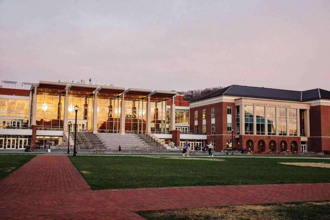
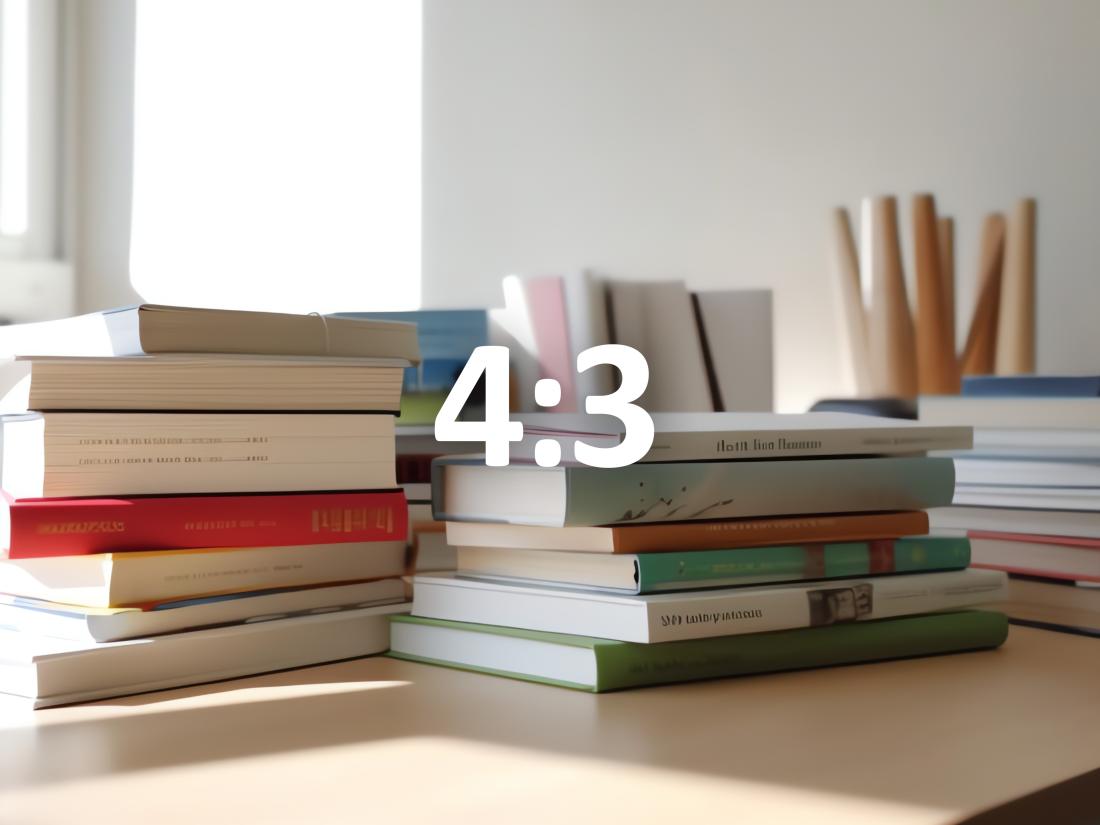
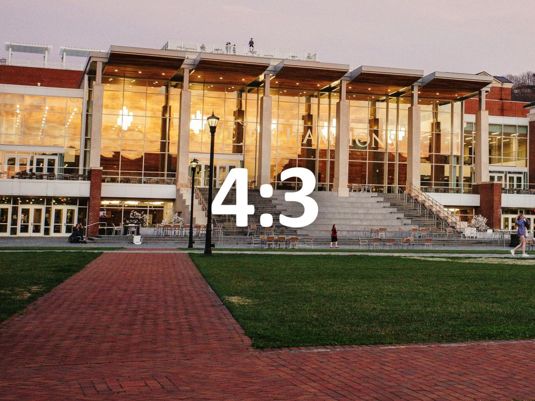
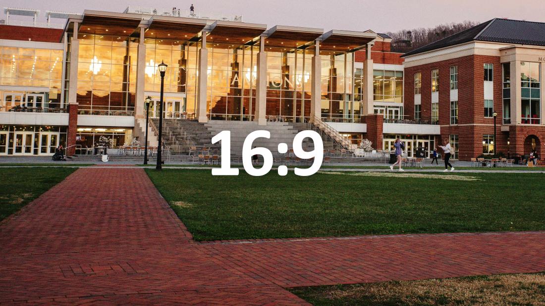
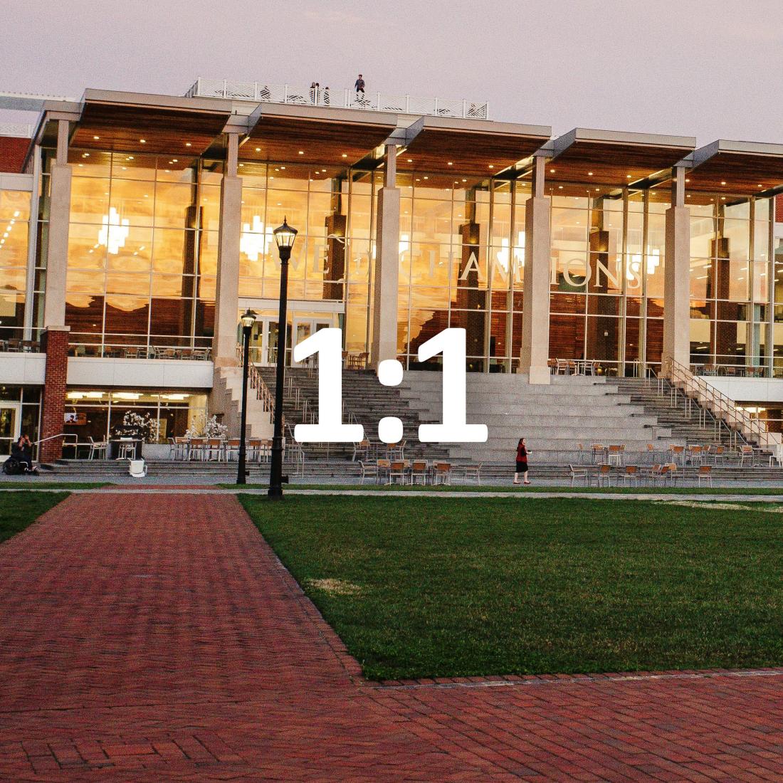
Aspect ratio is the proportional relationship between an image's width and height. Essentially, it describes an image's shape. Aspect ratios are written as a formula of width to height, such as 3:2. For example, a square image has an aspect ratio of 1:1, since the height and width are the same. The difference between image size and aspect ratio is image size can determine how big or small the image is on a page, and aspect ratio is the proportional relationship between its width and height which can determine its shape.
Image Configuration Styles Originals


3-column image width configurations, large limiter
Equal width configuration

50%/25%/25%


25%/50%/25%
25%/25%/50%

50%/25%/25% with text
Lorem ipsum dolor sit amet, consectetur adipiscing elit. Pellentesque aliquam suscipit lacus at ultrices. Nam ac aliquet leo, sit amet feugiat diam. Vestibulum consectetur orci elit, ac suscipit risus lobortis sed.
Praesent ac interdum tortor. Ut vel sapien nec nisl lacinia sollicitudin id at est. Sed eu augue sed nibh pharetra placerat.
2-column image width configurations, large limiter
Equal width configuration

25%/75%
33%/66%
66%/33%
75%/25%
75%/25% with text
Lorem ipsum dolor sit amet, consectetur adipiscing elit. Pellentesque aliquam suscipit lacus at ultrices. Nam ac aliquet leo, sit amet feugiat diam. Vestibulum consectetur orci elit, ac suscipit risus lobortis sed. Praesent ac interdum tortor. Ut vel sapien nec nisl lacinia sollicitudin id at est.